
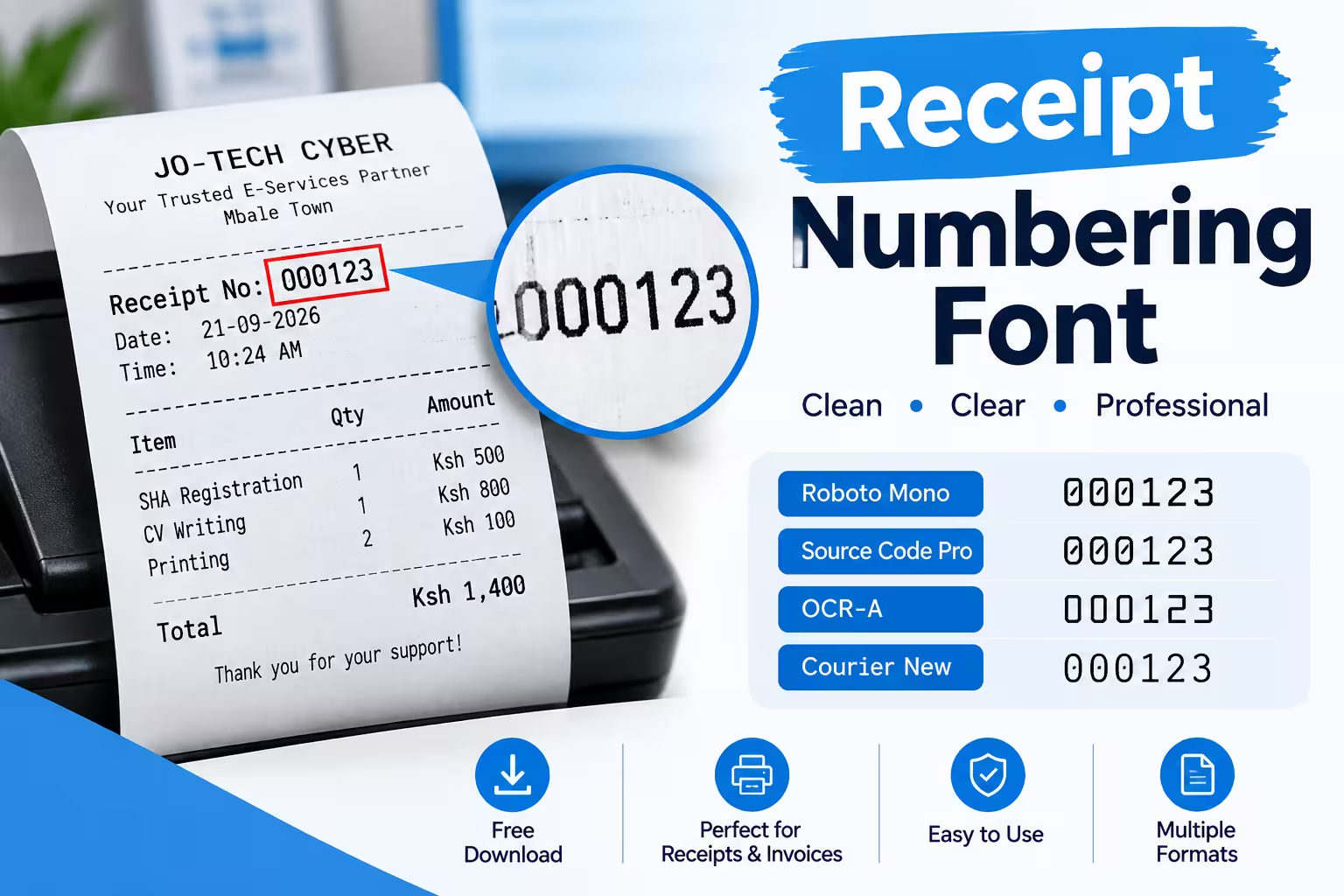
What Is the Best Font for Receipt Numbers?
The best receipt numbering font is a monospaced typeface with tabular figures — such as OCR-B, Consolas, Courier Prime, or DejaVu Sans Mono — because every digit occupies identical width, which keeps sequence numbers, dates, and totals evenly aligned instead of drifting or overlapping.
Proportional fonts like Arial or Times New Roman size digits unevenly (a “1” is narrower than an “8”), which makes numbers easier to misread on a printed receipt, a scanned copy, or a low-resolution thermal print.
That single choice affects more than looks. It determines whether a cashier can quickly match a return to its original transaction, whether an expense-tracking app can OCR the number correctly, and whether a receipt still holds up as a legible business record months later.
What “Receipt Numbering Font” Actually Refers To
A receipt numbering font is the typeface applied specifically to the sequential elements on a receipt: the transaction or invoice number, the date and time stamp, the register/till ID, and the human-readable digits printed under a barcode. It’s a narrower decision than picking the overall receipt font, because numbering has stricter functional requirements — digits must stay distinguishable from one another even when print quality is poor.
Retailers and receipt-generating software often use one font for the store name and item list, and a separate monospaced font just for numbers, so the sequence stays clean regardless of how long the item list runs.
Why the Font Choice Matters More Than It Looks
1. Optical character recognition (OCR) accuracy.
Expense apps, accounting software, and audit tools increasingly scan receipts to extract numbers automatically. OCR-B was purpose-built for this: it’s a monospaced typeface Adrian Frutiger designed in 1968 for the European Computer Manufacturers Association, later standardized as ISO 1073-2, and it’s widely used for the human-readable digits printed under UPC and EAN barcodes. Fonts built to that standard are engineered so a scanner and a human read the same character the same way, every time.
2. Thermal printer limitations.
Most POS receipt printers use direct thermal printing, which has a lower effective resolution than laser or inkjet output. Thin serifs and tightly spaced proportional digits can blur or fuse together at that resolution, while a clean monospaced font holds its shape. If you’re choosing or troubleshooting a font for a physical printer, our guide to thermal receipt printer fonts covers which typefaces print cleanest at 203–300 DPI and how to set them in common POS systems.
3. Recordkeeping and audit legibility.
For U.S. tax purposes, a receipt only counts as valid documentation if it’s legible enough to read every field on demand. The IRS has accepted digital and scanned receipts since Revenue Procedure 97-22, but the requirement is explicit: the digital copy must be legible enough that every field on the original can be read — vendor name, date, each line item, tax amount, and payment method — and a copy where key numbers are unreadable does not meet the standard. A numbering font that degrades on thermal paper over time can turn a valid receipt into an invalid one before tax season arrives.
4. Human error prevention.
Cashiers, warranty desks, and support teams reference receipt numbers constantly for returns, refunds, and lookups. A font that visually separates “0” from “O,” “1” from “I” and “l,” and “5” from “S” cuts down on transposition errors during manual entry.
Key Features to Look For in a Receipt Numbering Font
- Monospacing with tabular (lining) figures — every digit is the same width and sits on the same baseline, so columns of numbers stay aligned.
- Clear character disambiguation — distinct shapes for 0/O, 1/I/l, 5/S, 8/B, so misreads drop under both human and machine review.
- Simple, low-detail strokes — fonts without fine serifs or thin hairlines hold up better under thermal printing and repeated scanning.
- Adequate x-height and spacing — numbers need enough visual weight to survive fading, low print density, or a low-resolution scan.
- Broad system and firmware support — the font should render consistently across your POS software, receipt printer firmware (most use built-in ESC/POS command sets), PDF generators, and any browser-based receipt tool.
Best Fonts for Receipt Numbering
- OCR-B — the industry standard for machine-readable numbering, a monospaced typeface designed to be read reliably by both machines and people, used on payment slips and machine-readable zones worldwide. Best when receipts are regularly scanned for accounting or compliance.
- Courier New / Courier Prime — widely available monospaced fonts that render cleanly on almost any printer or PDF viewer, a safe default when OCR-B isn’t licensed or installed.
- Consolas / DejaVu Sans Mono — modern monospaced fonts with strong digit disambiguation, good for on-screen and app-generated receipts.
- Roboto Mono / IBM Plex Mono — clean, open-source options that pair well with a sans-serif body font for a more contemporary receipt design.
If you’re also deciding on the font for the rest of the receipt — store name, item list, footer — see our full roundup of best receipt fonts you can download free for pairings that work well alongside a monospaced numbering font.
How to Set Up a Numbering Font Correctly
- Separate the numbering style from the body style. Set your transaction number, date/time, and barcode digits in a monospaced font even if the rest of the receipt uses a different typeface.
- Test print at actual size. Digits that look fine on a screen at 100% zoom can blur at 203 DPI thermal resolution — always check a physical printout, not just a preview.
- Check disambiguation manually. Print a test receipt with the digits 0, 1, 8, and the letters O, I, S side by side and confirm each is distinguishable at a glance.
- Confirm OCR compatibility if receipts get scanned. If customers or your own accounting system will scan receipts into an expense tool, verify the numbering font is readable by common OCR engines — OCR-B is the safest choice here.
- Keep the font consistent across formats. If you generate both printed and emailed/PDF receipts, use the same numbering font in both so records match regardless of how the receipt was received.
Bottom Line
Pick a monospaced, tabular-figure font — OCR-B if receipts get scanned regularly, Courier or Consolas otherwise — and apply it specifically to your numbering line, not just your body text. It’s a small formatting decision that prevents misreads, keeps digital and printed records legible for tax purposes, and saves time whenever someone has to reference a receipt number by hand.